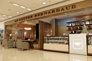
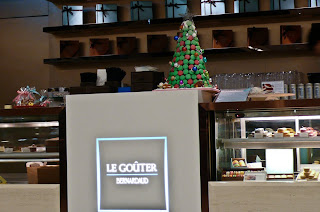
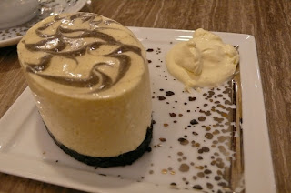
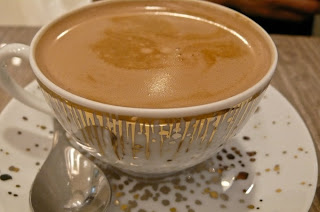
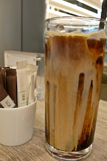
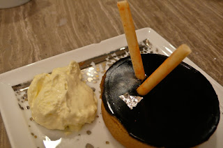
Originally wanted to visit MO HK tonight but again FULL. So to get a lingering thought of MO, I thought of the choco. drink and dessert made of Valrhona chocolate (MO's signature choco/mocha drink), offered by this local French cafe in IFC mall (opposite to Vertu and Leica shop). Tried the green tea sesame cake (from no. 3 photo onwards), hot mocha, iced decaf. coffee, orange choco. tart. All are pretty nice, esp. the orange choco. tart. Coffee pretty aromatic, at HK$36. Mocha at HK$45. Cake at HK$36. Average price considering it's in IFC. BTW, all the below photos are processed after Adobe Lightroom 3 and it's under Pixmation's influence, but I didn't spend much time to fine tune the photos, but I noticed it helps to solve the light effect problem. Like below photo 2, originally the words Le Gouter are difficult to see clearly. It helps to fix quite many problems. Very sleepy.... ZZZzzz
8 comments:
hehe, now I getting you to spent more and more money on photography related products.
A lot of the time, I will use the auto light (Command-U) and auto white balance (Command-Shift-U) first. 70% of the time it does and pretty good job. If not, I just undo it and adjust manually. Remembering the short cut keys can speed things up a lot.
You guys are more and more pro in taking photos.
Next time please use your good camera and your super skill to make me look rounder and Chris look thinner.
:)
Yes, I tried some of those auto white balance but it's a bit way out-balanced on some of the photos as the original color of the subject itself. Like I told you before, I have no idea why I prefer photos with dim light, just like how I turn the TV volume to very low. However, I turn up music very loud.
Stella, on photography skill, mine isn't detailed and fine tuned enough. Pixmation does inspire me a lot, especially on buying something I never thought about - flash. Tell you a brief story, Pixmation settled down in CA due to my lucky draw ticket. Now that I studied more about photography due to my hard-sale of the DSLR to Pixmation. Then it's another bounce back from my ex-discouragement to Pixmation from not taking photography many many years ago. Round and round, it goes. Give and take. Take and give. Every one is a giver and every one is a gainer. If we only gain and gain, how do we have space to gain if we don't give. So those who think they can only gain can't gain because they don't give. :)
It's just a matter to preference that you like dim photos more. From a production point of view, it would helps more if you take the photo as standard exposure or even push 1/3 or 2/3 of a stop higher so you get a brighter photo (unless some part of the photo will be way over exposed). Then you can dim the photo in lightroom to suit your taste.
The reason being brightening a dark photo will bring out noise with too little details but darkening a bright photo will keep the details in the shadow area.
That's why you see a lot of night scenes in movies seldom really shoot at night.
So all those "ping pong" back-and-forth cause and effect stories between you two started with your lucky ticket....... What a good lucky draw.
Yes, even I can tell the two of you are good photographers. Thank you for the sharing here.
Yes, production wise, it has to be in brighter side and to the general public, it has to be brighter to catch people's attention. Mine is on my own preference. :)
I recall I passed by a movie night shooting scene that outside a cafe in Central, lots of lighting were set up to make the outside look brighter. Otherwise, it's hard to see the outside from the cafe. Actually I was about to take that night movie shooting. My purpose was to tell the others to appreciate movie production since it involves so much equipments and manpower. :)
Stella, mmh.. then there might be some other ways, but everything is arranged. Pixmation took graphic design and now that he can incorporate so well his design concept into photography and the way of his being artistic. I like the way he endures to study things in details. Many others including me are "big prawn heads".
Hi SEA,
I don't think you are big prawn head at all. If you are, we are all lobster heads. :)
Post a Comment